How can we help you?
Scheduled reports: how to read the report?
You will receive the Future Business Trends report by email, under the custom name and frequency of sending you have chosen.
Here, we detail the structure of this report to serve as a guide, helping you interpret the data more efficiently and supporting quick, strategic decision-making.
This report is structured into two key sections:
-
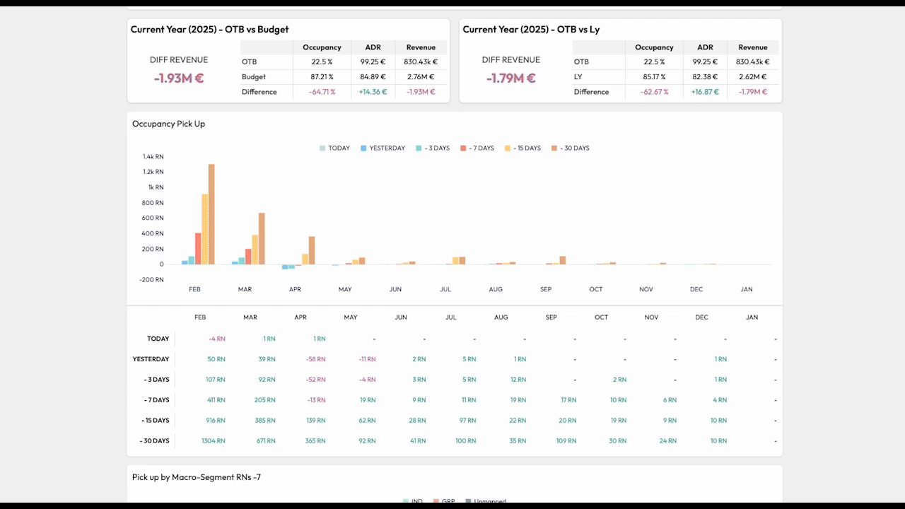
Current Year Overview: This section provides a quick view of metrics such as ADR, occupancy, and revenue from current year, along with comparisons to the budget and LY (in percentage points). It offers a general overview of the hotel’s performance. Designed for decision-makers, this section helps identify whether current performance is aligned with goals or if a deeper analysis is required.
-
Graphs Representing Key KPIs: These graphs provide a detailed view of key performance indicators, segmented to analyze various business areas. Additionally, a table with data for the current month and the next 11 months is included. Below are the graphs:
- Revenue Performance: Highlights how hotel revenue is performing against the forecast, STLY, LY, and budget.
- Occupancy Pick-Up: Shows the evolution of booking pace across different time frames (from today to -30 days) with monthly details.
- Pick-Up by Macro-Segment: Provides insights into which macro-segments have contributed the most to bookings over the last 7 days (in terms of room nights).
- Occupancy Performance: Displays how hotel occupancy is performing compared to the forecast, STLY, LY, and budget.
- Occupancy by Macro-Segment: Visualizes performance across different macro-segments (e.g., corporate, leisure). The order displayed corresponds to the order of your macro-segment configuration.
- ADR Performance: Shows how the average daily rate has evolved over time compared to the forecast, STLY, LY, and budget.
- ADR by Macro-Segment: Tracks OTB - ADR evolution by macro-segment with comparisons to forecast, STLY, LY, and budget.
How to Interpret the ADR, Occupancy, and Revenue Trend Graphs? In each column, you will see data represented as OTB vs. Forecast and STLY. If the forecast is lower than OTB, it will not be displayed on the graph.
STLY is shown as a yellow line inside the monthly column. Additionally, historical data (LY) and budget are represented by trendlines, with the budget appearing as a dashed line.
You can download the report for your hotel by clicking on the PRINT button at the right top of the screen.
Recommendations from BEONx for Analyzing the Graphs
- Identify trends: Compare current performance with historical data, forecast, and budget to detect patterns.
- Focus on key variations: Use the summary to identify standout, underperforming, or improvable areas, then analyze the graphs for more context.
- Optimize strategies: Segmented data enables adjustments to pricing strategies, marketing campaigns, and operational priorities.