How can we help you?
Recommendations detail view
On the detail view of recommendations (Menu>Recomendations>Detail view), you can go deeper on the price recommended for each day.
On the filters, you can select the type of space and rate plan to visualize. You can also select the date in advance you want to study.
You can visualize this information by day or month.
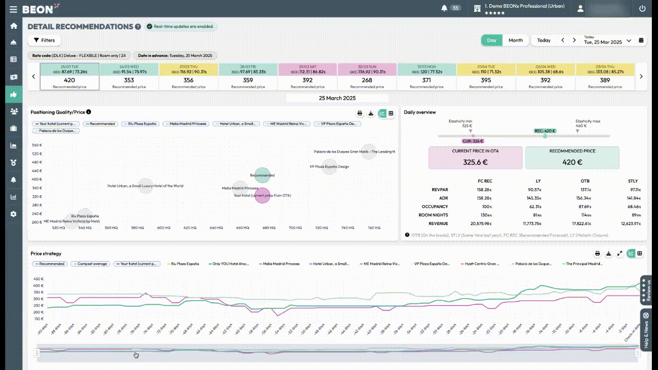
The screen is divided into 3 differentiated parts:
- At the top of the screen, you can see the price recommended for each day. You can identify days by:
- Green: The recommendation is to increase your price
- Red: The recommendation is to decrease your price
- Grey: The recommendation is to maintain the price
- Yellow: There is no availability for the space and rate plan selected
- Below the calendar, is the quality vs price graph, which informs you about the hotel positioning. .
-
On the right side of the Quality vs. Price graph, you’ll find a slider displaying your current and recommended rate, along with a summary of the hotel’s performance for that specific day (RevPAR, ADR, Occupancy, Room Nights, and Revenue). Additionally, you can see the SmartRange price position, which defines the optimal price range within which a hotel should operate to maximize profitability.
-
At the bottom of the screen, there are four graphs that will allow you to analyse the pace for different KPIs:
- Price strategy: compares the evolution of your price and your competitors.
- Occupancy: Pick up pace view
- ADR and RevPAR evolution
Note: By selecting the month option in the upper right corner of the window, the same analysis will be obtained but with the accumulated data for each month, with the difference that the selected price simulation will not be available.
Other articles related:
- How to visualize price recommendations and restrictions by channel
- How to edit a recommendation
- How to override a price so that the recommendation does not change
- Make a massive override
- How to identify changes in the recommended price
- To send restrictions to the PMS or Channel Manager
- Recommendations detail view
- To send price and restrictions with the massive edition
- How to review what is sent to the PMS or Channel Manager